AboutFace Magazine Cover Design
A creative exploration of Typography within limitations
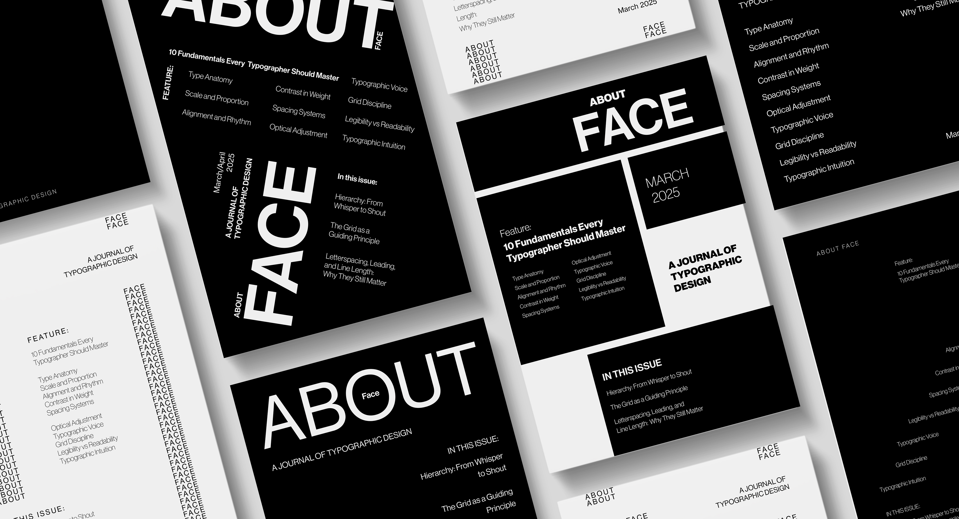
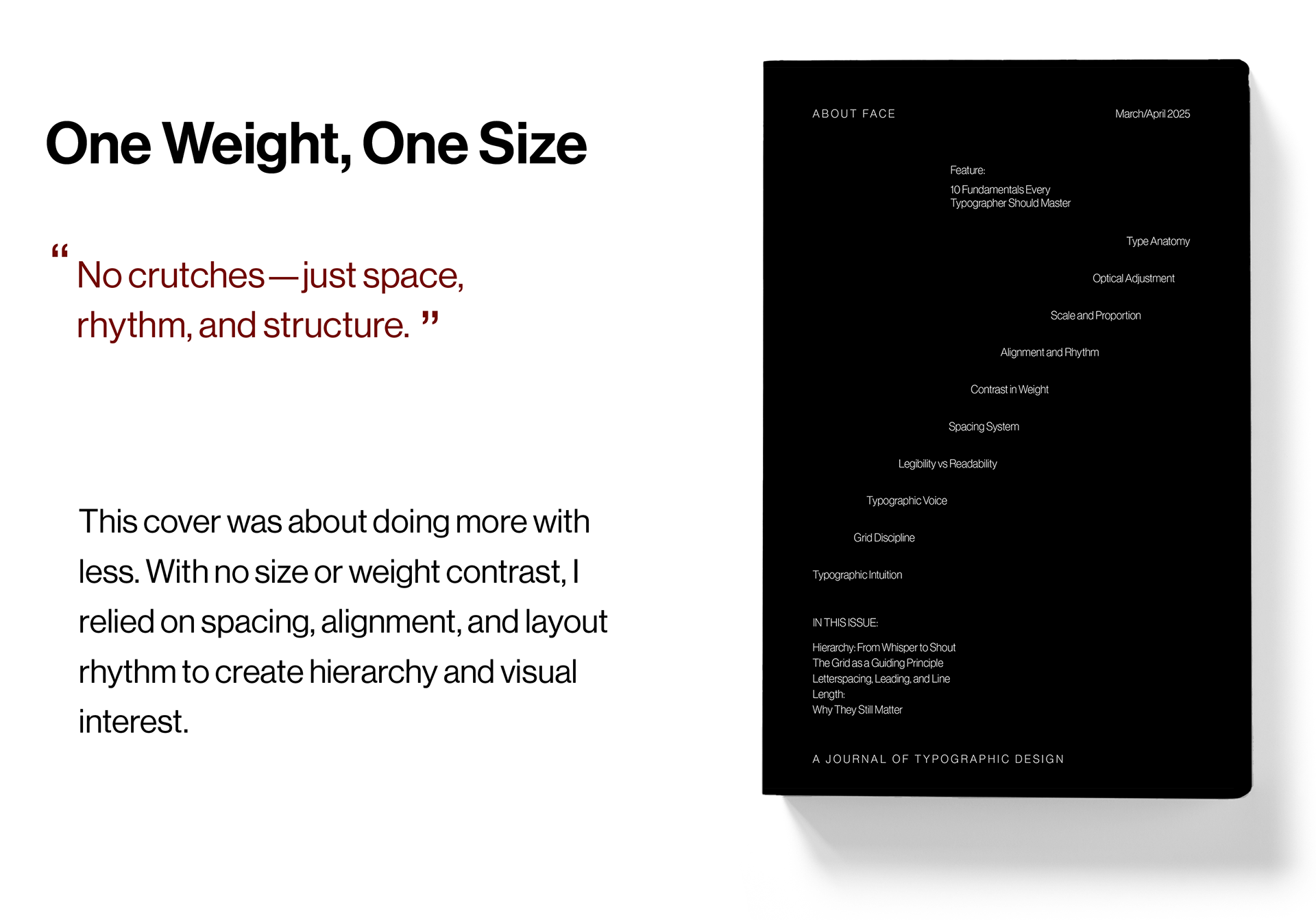
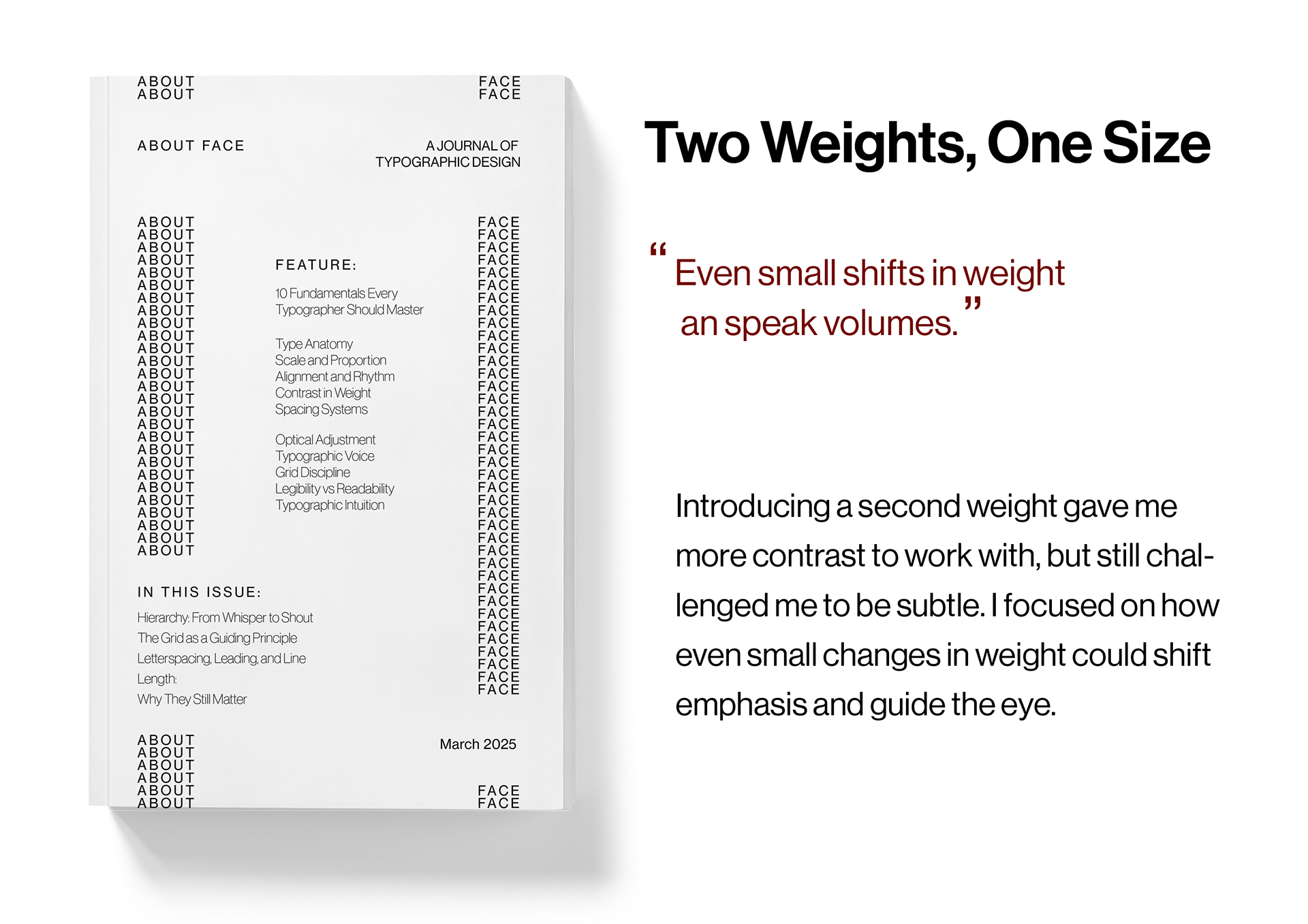
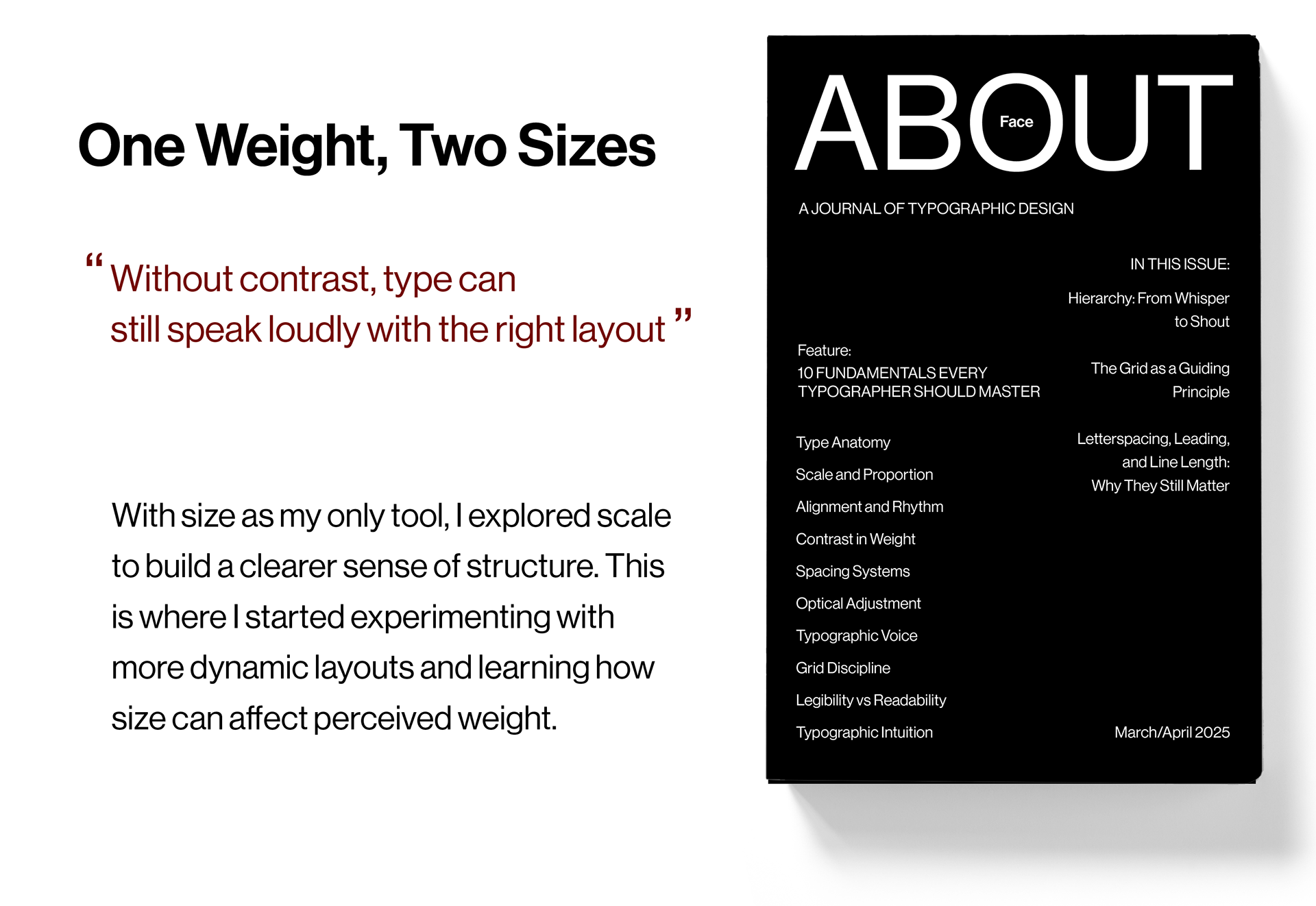
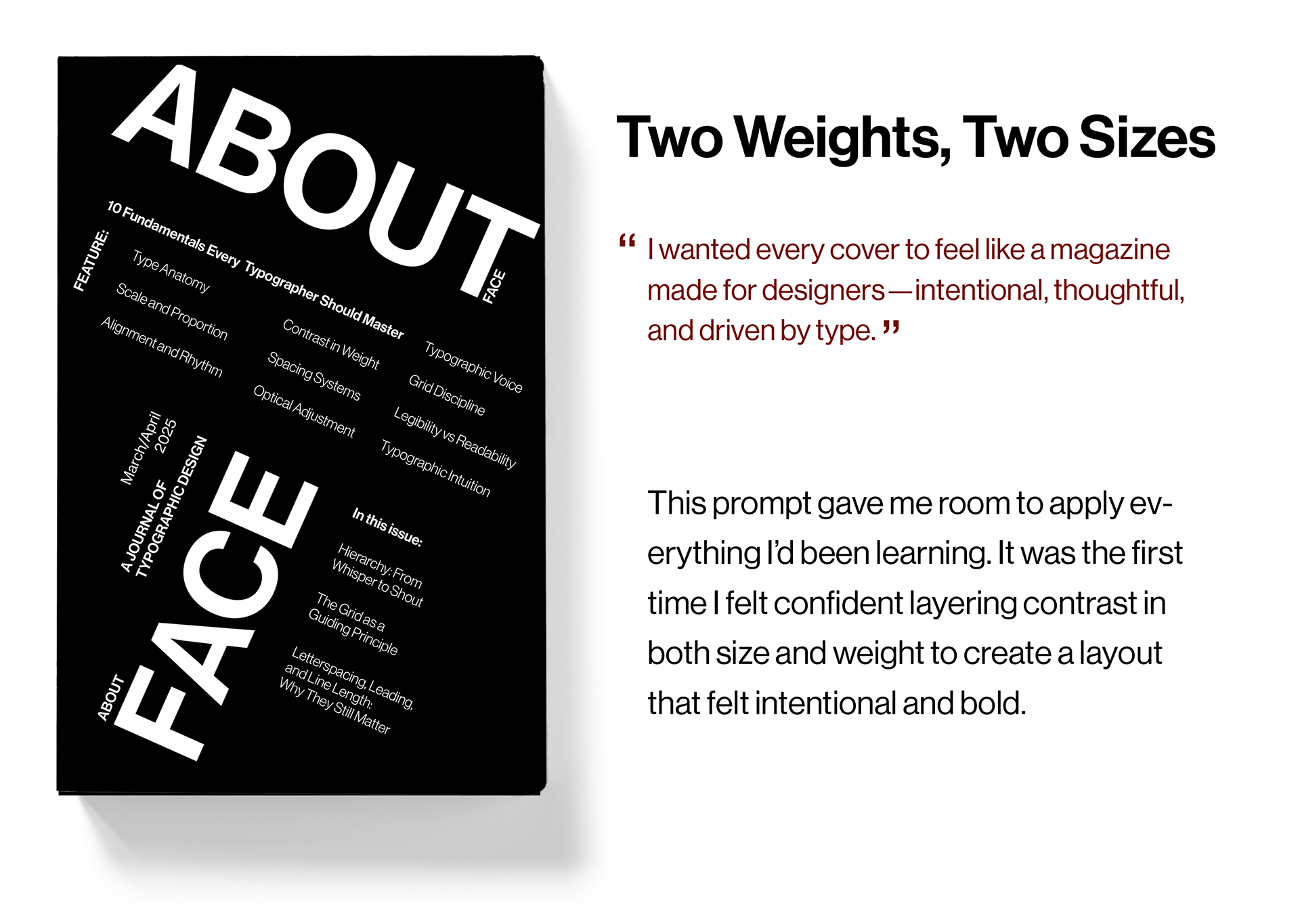
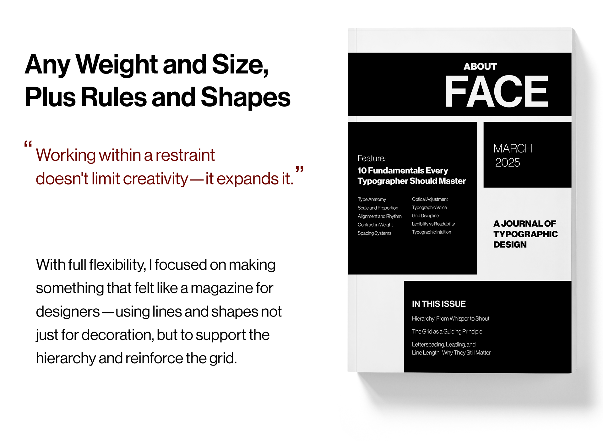
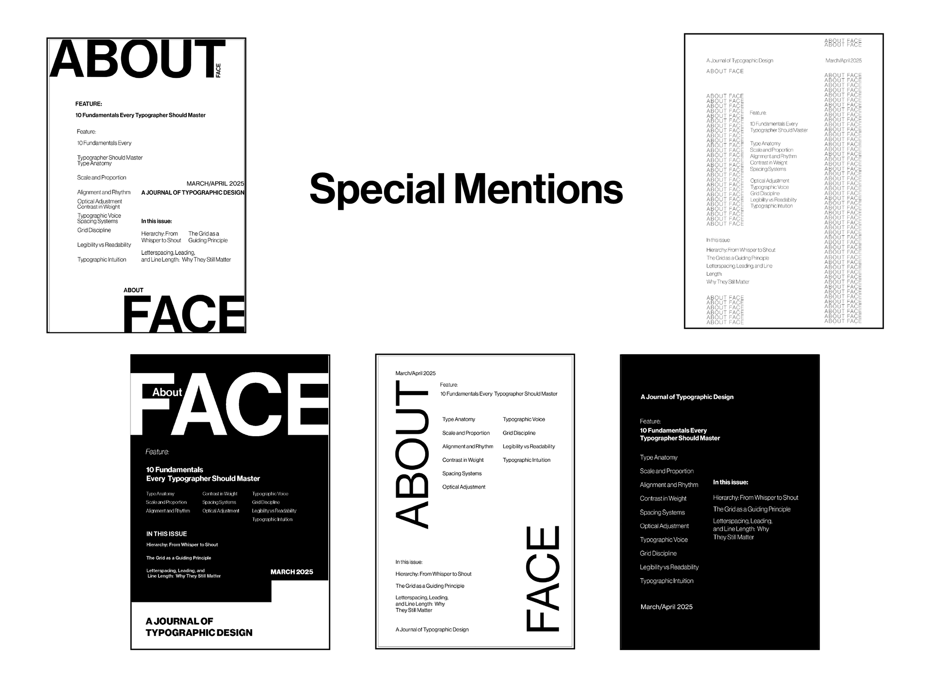
This project challenged me to design five black-and-white covers using only limited font weights and sizes, pushing me to find creative ways to build hierarchy and structure. At first, the constraints felt limiting, but they taught me how much is possible with just a few tools. I started asking better questions—like how to make type stand out without relying on size—and by the fourth prompt, I began applying what I’d learned in a more intentional way. Working without a crutch forced me to grow, and this project helped me gain confidence in solving design problems through restraint.
In Conclusion...
This project taught me that good design doesn’t come from having endless options—it comes from knowing how to work with what you’ve got. Each constraint challenged me to think differently, problem-solve creatively, and become more intentional in every choice I made. I walked away from this experience with a stronger understanding of typographic hierarchy, a deeper respect for structure, and a new level of confidence in my ability to design with clarity and purpose—even when the tools are limited.